Storyboard Artist, Graphic/Asset Designer, 3D Modeler, Video Producer/Editor
The Mission: 🎯
We were tasked to create an explainer video with a time limit of one minute for my Rich Media Communications class at SAIT Polytechnic. We had the freedom to create it however we want, it just had to include a proposal, storyboard, script, and the final video for our submission.
My idea was going to be based on a fictional item that can assist with individuals who tend to to be forgetful.
Storyboard of video
Challenges Faced: 🤔
I had some troubles figuring out the atmosphere of the video. Because of that, it took me a little while to think of which sounds/music to go along with it.
Rendering the 3D models would often take awhile. There were multiple moments when the application would freeze and close down.
As I was recording my voice, I did not have the right equipment to do the task as I wanted to; it didn’t sound clean enough. I only had my phone to use.
We were not taught much about Cinema4D so I had to rely on video tutorials online to get my ideas across.
Explainer Video Animation Script that includes video descriptions and audio used.
Outcome:
At the end, I chose to create an explainer video that showcases a fictional ring that helps individuals remember their task(s). I presented it with an informative yet quirky atmosphere throughout the video. I wanted the audience to be captivated yet informed. I’ve also implemented all the 3D modeling I had planned to let the viewers visually see what the ring looks like in a hyperrealistic way.
Adobe Illustrator, Adobe Photoshop, Adobe After Effects, Mural
Responsibilities:
Brand Designer, Graphic Designer, Video Producer/Editor
The Mission: 🎯
I was a part of a 4 member team project for one of our last semester classes at SAIT Polytechnic. Our team reached out to a non-profit organization client and volunteered to assist the re-brand of their company. Originally, they generated all of their designs (including their logo) through Canva and had no website built. They decided that they would like a whole re-design on their brand, plan marketing strategies, and have a website made for them.
My sketches of the new KNXION logo.
My team and I's moodboard in Mural.
Challenges Faced: 🤔
The client wanted to merge two of the logo concepts; however, the logos he wanted to combine were done by two different designers with two different design styles.
One of the other graphic designers created the wrong logo concept that we discussed with them about. They also submitted it to us in the last minute. Another team member volunteered to quickly vectorize them a few minutes before meeting up with the client.
Initially, I was not a part of the graphic design team. Unfortunately, one of our team members was not uncommunicative and would not respond to our messages. To that, I had to help out with the graphic design responsibilities.
There were some miscommunications when it came to the back-end development of the website. We had to brainstorm solutions that the client could manage easily once we pass it off to them.
My logo concept #1
My logo concept #2
Outcome:
After showing the client 3 logos to choose from, they finally chose a concept they liked but requested a few touch-ups on it. By the end of it, they decided on the final logo that was sent to them with the “K” and “N” being represented as people connecting with one another. When it came to the website, we were unable to completely finish it due to miscommunications, and delayed responses. We did the best we could with the time we had and what we were given. We prioritized the components that needed to be done to easily pass it off to KNXION and let them edit the rest whenever they could!
For this personal project, I focused on improving and reviewing my knowledge in the UI/UX field on web design. The goal was to help users easily navigate through this new restaurant website while capturing their attention throughout with a captivating interface. I wanted to highlight the most important notes that were mentioned in the user personas and implement those elements onto the site for everyone’s benefit.
Empathy Map
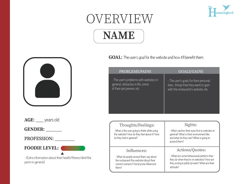
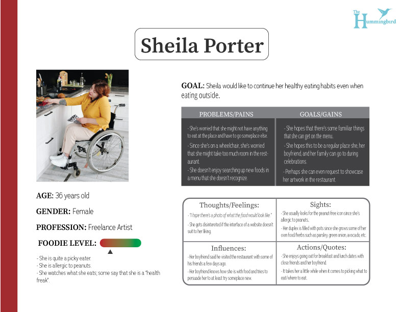
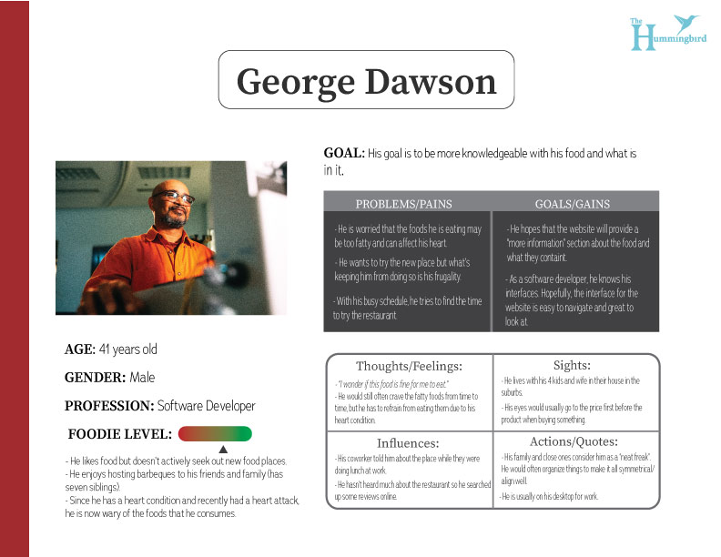
User Personas
Challenges Faced: 🤔
Question in mind: “Which colour palette should I use for my branding that can make this appealing to look at and not strain people’s eyes?”
Question in mind: “I’m not that used to the Laws of UX just yet, but I need to keep it in mind when creating this site.”
Considering I have never used Figma before this, I had to quickly learn where the elements were. Though it does have very similar components to Adobe XD, there are definitely some differences to it.
Question in mind: “What’s usually in a casual restaurant website? I need to do some comparisons and note down the most frequent elements/layouts that are used.”
Question in mind: “I was planning on putting this menu bar here. But I have no idea how to do it on Figma. I should find an alternative solution.”
I had to research that the prototyping area in Figma did not have a responsiveness feature to it (at the time).
Low-Fidelity Wireframes
Medium-Fidelity Wireframes
Outcome:
Throughout my journey in creating this design, I have settled for a slick and minimal design to not confuse the user and get them to easily navigate around the website. I’ve also decided to change the sticky side menu bar that was originally in the medium-fidelity wireframe into a top sticky instead since I had trouble figuring out how to make it on Figma. On the up-side, it did create more white space for the menu, allowing more breathing room for the elements.
This was a personal project to further enhance my UI (and a few of my UX) skills. The goal was to practice mobile-centered UX/UI design as I’m more used to doing web design. The application focuses not just in workouts but fitness in general. I had to think and do further research on the topics and include features that can enhance someone’s health in the long run in a interactive way.
Empathy Map
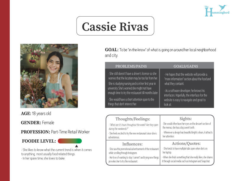
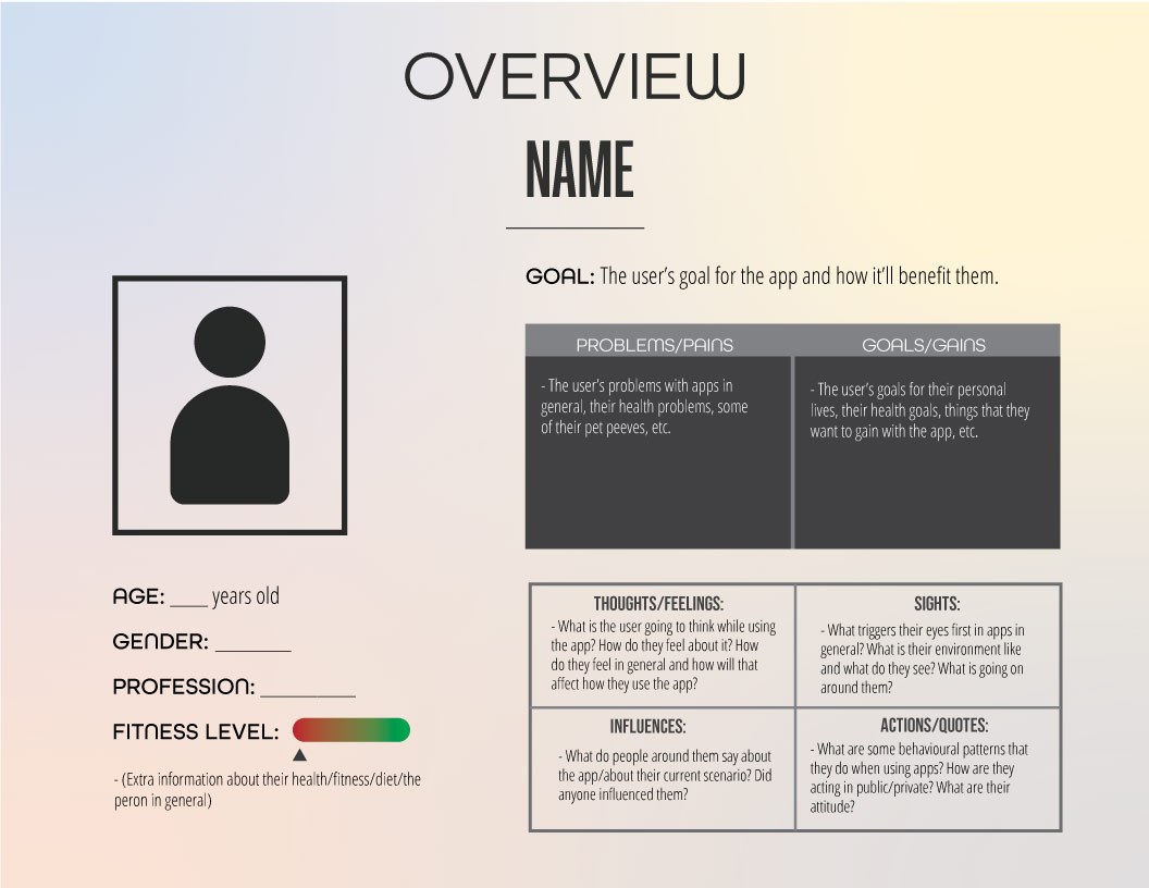
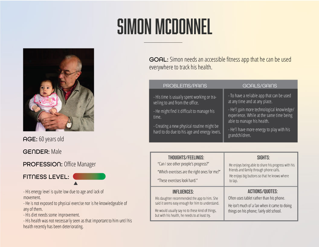
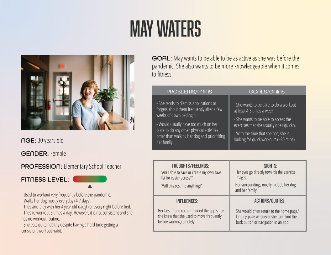
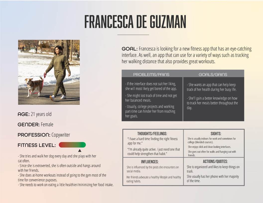
User Personas
Challenges Faced: 🤔
Brainstorming notes on empathy maps was a challenge since I had no real data to pull from as I was more focused on the UI aspect of the project. I had to rely on competitive analysis research on various fitness apps that were similar, and my own experiences from the past.
I had to research what other features can be implemented in the app that users tend to keep in mind while keeping track of their fitness goals (I created a food/water tracker page, and a music page).
Question in mind: “Which fonts and colours will look the best and will send out the tone of voice I’m trying to convey?” (Tone of voice: Strong, Encouraging, Friendly)
Question in mind: “Which elements would be better to have on this landing page? Which elements would be more beneficial for the user?”
Question in mind: “What signifier can I implement to let the user feel accomplished about tackling their daily workout challenge and keep them motivated?”
Low-Fidelity Wireframes
Medium Fidelity Wireframes
Outcome:
After drafting multiple wireframes and debating with various choices, I was able to create and put together a finalized design. I’ve went with a minimalistic design as the attention should be on the functionality of the app. I included a social aspect to it: sharing their progress on their social media and the top exercises done that week. This may entice the person to be more motivated if others were involved in their journey. There are also trophies to be earned, which may be beneficial to those who are competitive and gets motivated through achievements. I kept in mind the types of people that might use the app, so the workouts are divided into three separate levels according to the person’s fitness intensity.
Web Developer, Web Designer (UX/UI), Graphic Designer, Product Photographer, Content Writer
The Mission: 🎯
For this project, I created a fictional eCommerce website for my college final project. I was given the logo and its branding standards (colour palette and fonts). However, I was then tasked to create everything else-from the website layout to content writing to product photography to web development.
My goal was to create a website that had a similar feel and look as other tech websites out there. I wanted the visitor to instantly recognize that they are in a tech commerce website just from how I laid things out.
Low-Fidelity Wireframes
Challenges Faced: 🤔
I had troubles displaying the tone of voice I wanted to convey. I looked at various tech websites – such as Best Buy, Visions Canada, The Source, Canadian Tire – to get a sense of what similarities they had. I needed to know which components were most prominent in their websites and get a sense of the lay out of their elements.
Considering the logo and the colour scheme was already given to us, I had to plan out where each colour would suit best since I am unable to change them. I tried using colour theory and design techniques to test them out.
At the time, I still had a small knowledge in back-end web development. So, coding the website became a challenge; I had to keep in mind responsiveness too.
I also wanted to implement some features that had not been taught to us (i.e. removing cookies thus deleting items in the cart/wish page). Due to that, I had to allocate some extra time to research how to do it for a better user experience.
Medium-Fidelity Wireframes
Outcome: ✅
I was able to accomplish everything that was needed and asked of us. When it came to resizing the browser, the responsiveness aspect was quite “iffy” to tackle; the best viewport to view it in is around 1900px. However, it’s still capable to be viewed in mobile mode and gets the job done. I was able to implement my plan to go further by adding a Wishlist feature, and adding a delete button in the Cart and Wishlist page (playing with cookies).
High-Fidelity Wireframes , Prototype, and Website
> To visit the website, click the link here. > To view the desktop prototype, click here. > For the mobile prototype, visit the link here.
This one was a personal project to practice further on my design skills. For this logo, I was brainstorming designs that can be relatable to a collective of people. Then, I was inspired by this print that says “Anti Social Social Club”. It made me want to create a club of sorts for those who have a big sweet tooth like me.
The goal was to create a logo and incorporate that into mockups, and turn it into a 3D model.
Rough sketches of logo; brainstorming.
Challenges Faced: 🤔
I wanted to create a group name that was simple yet catchy, and easy to remember.
Brainstorming various ideas on how to create a minimalistic design yet eye-catching.
Question in mind: “What sorts of components do I have to implement to visually show the name in a creative way?”
Question in mind: “What technique in Illustrator do I use?”
Question in mind: “Which colour(s) do I use for this graphic that doesn’t make things look too cluttered?”
My design should compliment a light/dark background, as well suit in multiple products types that can be made for print.
Finalized logo!
Outcome:
I ended up creating a typographic logo with a mix of a symbolic logo. I had to think about the name and went with “Sweet Tooth Club”. I also chose the colour blue as it contrast with a dark background but compliments well with a light one too. The blue also brings out a “friendly” tone to the audience. I wanted to also incorporate it into a 3D video to strengthen my skill in that area as well.