For this personal project, I focused on improving and reviewing my knowledge in the UI/UX field on web design. The goal was to help users easily navigate through this new restaurant website while capturing their attention throughout with a captivating interface. I wanted to highlight the most important notes that were mentioned in the user personas and implement those elements onto the site for everyone’s benefit.
Empathy Map
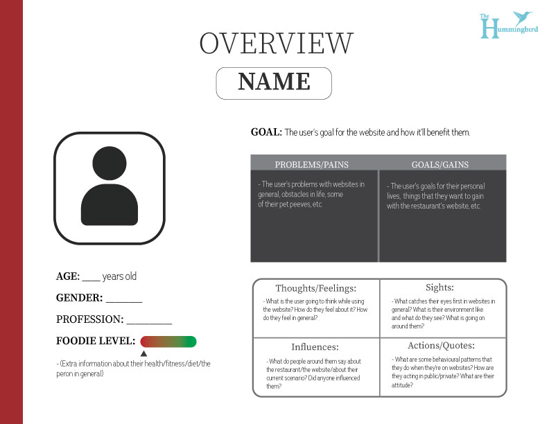
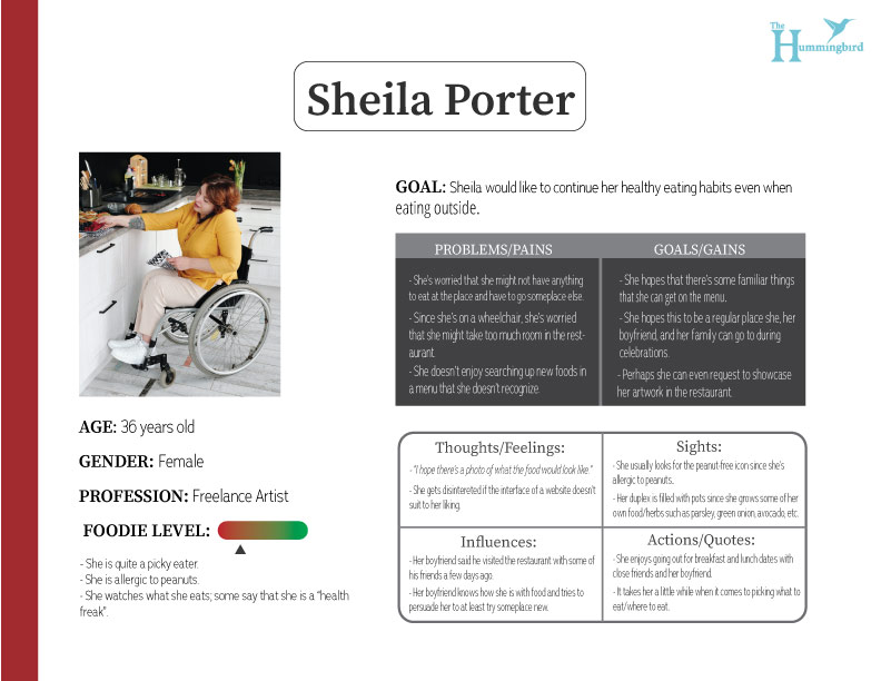
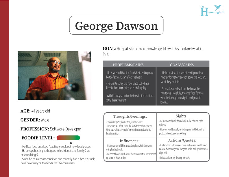
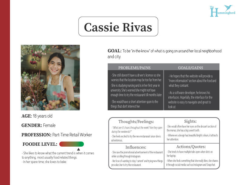
User Personas
Challenges Faced: 🤔
Question in mind: “Which colour palette should I use for my branding that can make this appealing to look at and not strain people’s eyes?”
Question in mind: “I’m not that used to the Laws of UX just yet, but I need to keep it in mind when creating this site.”
Considering I have never used Figma before this, I had to quickly learn where the elements were. Though it does have very similar components to Adobe XD, there are definitely some differences to it.
Question in mind: “What’s usually in a casual restaurant website? I need to do some comparisons and note down the most frequent elements/layouts that are used.”
Question in mind: “I was planning on putting this menu bar here. But I have no idea how to do it on Figma. I should find an alternative solution.”
I had to research that the prototyping area in Figma did not have a responsiveness feature to it (at the time).
Low-Fidelity Wireframes
Medium-Fidelity Wireframes
Outcome:
Throughout my journey in creating this design, I have settled for a slick and minimal design to not confuse the user and get them to easily navigate around the website. I’ve also decided to change the sticky side menu bar that was originally in the medium-fidelity wireframe into a top sticky instead since I had trouble figuring out how to make it on Figma. On the up-side, it did create more white space for the menu, allowing more breathing room for the elements.